
Extraordinary designs:
Four years of Good Ordinary Claret label art
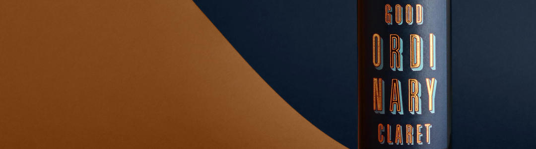
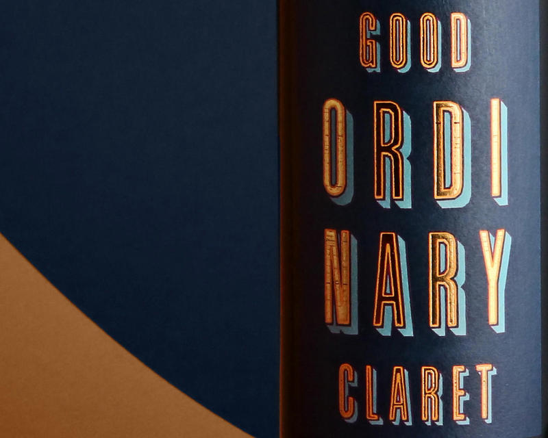
Good Ordinary Claret. Beguilingly simple, it alludes to the dependable familiarity you’d expect from an old friend – while hinting, ever so subtly, that this wine is more than just ordinary.
Our everyday label depicts a timeless scene: our home at No.3 St James’s Street. It situates Good Ordinary Claret at the heart of our brand, in a corner of London which has long been associated with life’s good ordinary pleasures.
It’s a bottle we love to drink, share and celebrate. Each year, we collaborate with a different artist or designer to release a limited-edition label that re-interprets the spirit of GOC. Each label, though vastly different in style, draws out an imaginative playfulness that has always married happily with wine.
We look back at four years of GOC label designs which have been anything but ordinary.
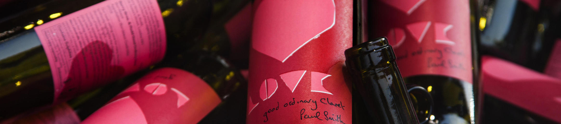
SIR PAUL SMITH
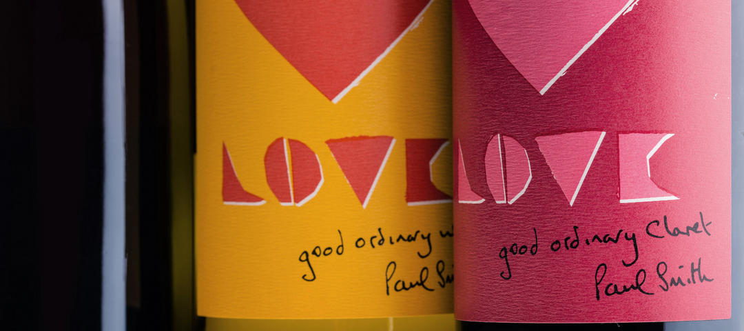
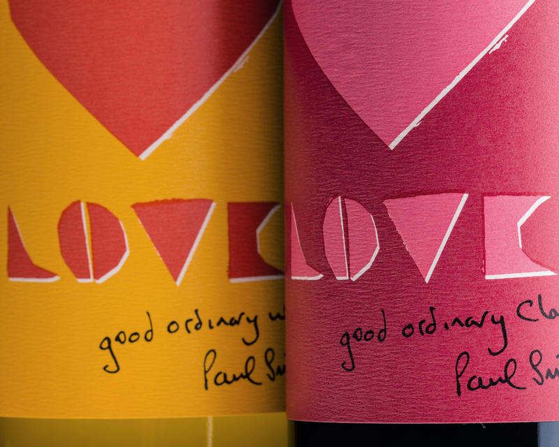
Our very first collaboration was in 2016, when we paired up with British fashion designer Sir Paul Smith. Released in February, Smith’s stylish, romantic design came just in time for Valentine’s Day. He said, “I’m probably just an old romantic but I’ve always taken Valentine’s Day seriously, with a nice card and a gift for my wife. These labels are a great bit of fun; a nice thing that you can give to a loved one.”
LUKE EDWARD HALL
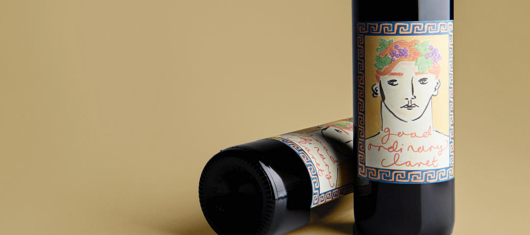
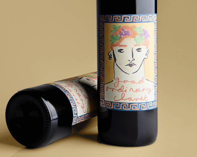
In 2017, we collaborated with artist-come-interior-decorator Luke Edward Hall. The label payed homage to Greco-Roman heritage: a portrait illustration of Bacchus, ginger hair crowned with grapes. He told us, “I draw a lot of people; I like drawing faces, so I thought it would be fun to do a face. And I do a lot of ancient Greece and ancient Rome inspired-drawings, so a Bacchus seemed like a fitting idea. He has that mischievous vibe about him.”
KATE BOXER
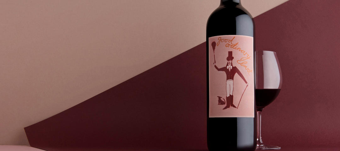
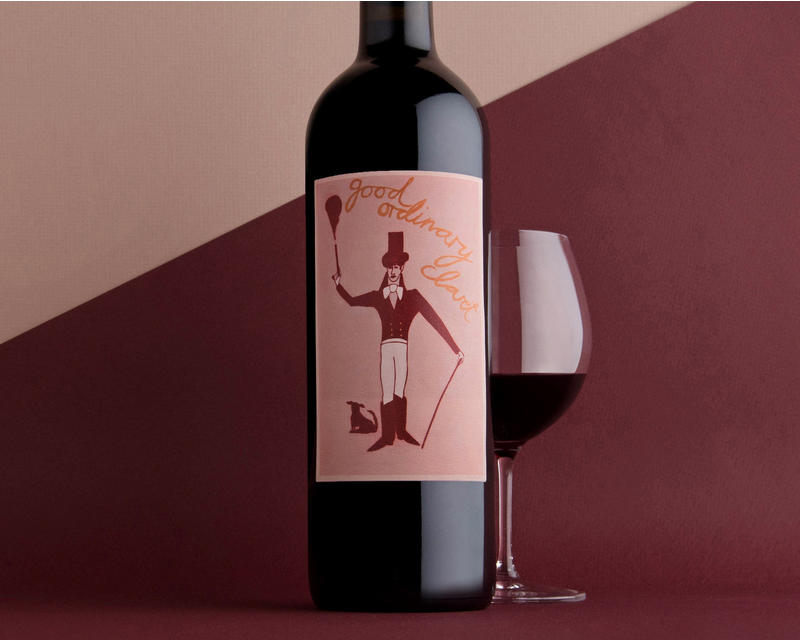
2018 saw us collaborate with painter and printmaker Kate Boxer. The resulting label depicts a dandy figure shooting a pistol, with a small dog at his feet. “It’s not Beau Brummell,” she explains, “but he is a Beau Brummell-y figure, with Figgy my dog… It’s like the things I’ve done for my last few shows – painting very well-known people, from Mary Shelley to Fellini. I find that, from reading their books or watching their films, they lurk around in your head, and they become part of your psyche. It was like that with Beau Brummell.”
IAIN AND JANE
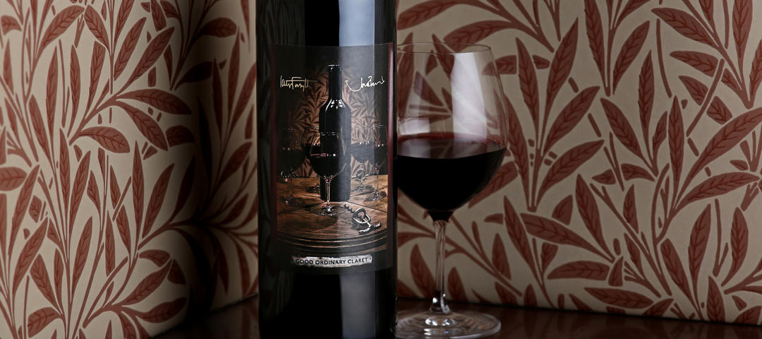
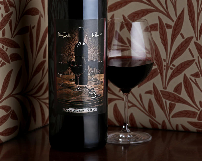
Our most recent – and innovative – collaboration was with artists and filmmakers Iain Forsyth and Jane Pollard. This photographic label utilises the multigraph technique; at first glance, the label appears to depict five glasses of wine atop a table – but when you look closely, you realise there’s only one real glass in the image. “We were doing a project on spiritualism and the exposure of fake mediums. We came across a photograph that, at first glance, looked very much like a photograph of a séance – of a group of people holding hands. When we looked more closely, we realised that it was the same person – or five identical people sat around a table holding hands.”