

This year’s limited-edition Good Ordinary Claret label has been created for us by artist Poppy Lennox, who works with paper, wood and thread. Here, we speak to her about her inspiration and process, and the experience of collaborating with Berry Bros. & Rudd
Usually, you can tell quite a lot from an artist’s space – disordered and chaotic; calm and minimal; frenetic or peaceful. So, talking to Poppy Lennox over a temperamental WhatsApp call should have made it harder to get a sense of her, and how she creates her art. But – from the considered way she speaks to her artwork itself – it quickly becomes clear that her demonstrable creativity is balanced by order, structure and precision.
Poppy, 40, lives and works in north-west London. Her studio is a small space at the top of her family home – transformed from its previous designation as “the spare room” to become her sanctuary. “It’s my haven of quiet; there is something very important about coming up to my own space,” she says. “It’s somewhere you can enter into; your creative mind begins at that point. I’m always thinking and exploring but I consolidate those ideas when I come to sit at my desk. It’s tiny, but it’s my own.”
It’s here that, surrounded by neat rows of thread and pencils, she creates her pieces: stitched and drawn designs. “I predominantly work with paper and wood, always using the mediums of 23-carat gold leaf, paint and gouache,” Poppy explains. “I finish the designs stitching into paper or wood. The way in which the stitch sits on the surface gives it a slight sculptured textural element; the texture gives extra impact.”
Poppy’s background and training as an artist, working with sculpture, has very much informed the pieces she produces today. “I studied sculpture and art history, working in 3D materials,” she explains. “I worked a lot in wood which I think led me on to this fascination with it as a material. But I’ve also worked in many different creative industries – advertising, set design and in exhibition management, and I think it’s this combination of art school and facilitating jobs that has influenced my work.
“I have a creative mind and thought process twinned with design-led and organisational focus. I think that’s where my work is quite organised and considered.”
Collaborating with Berry Bros. & Rudd
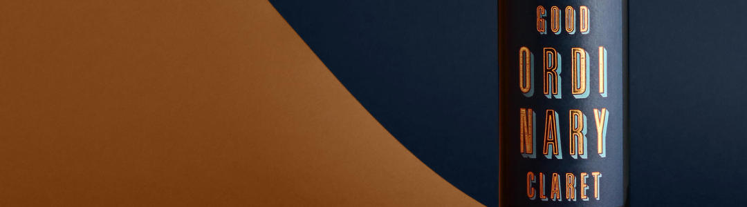
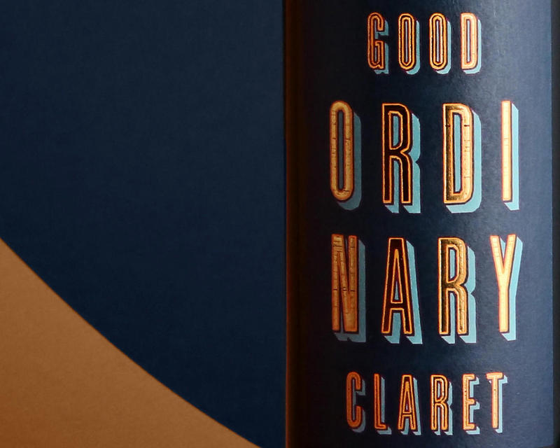
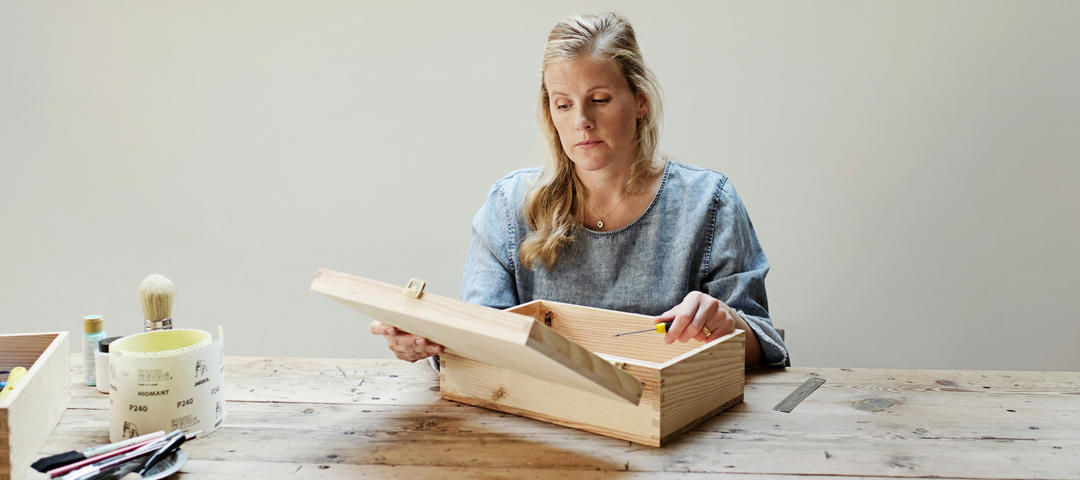
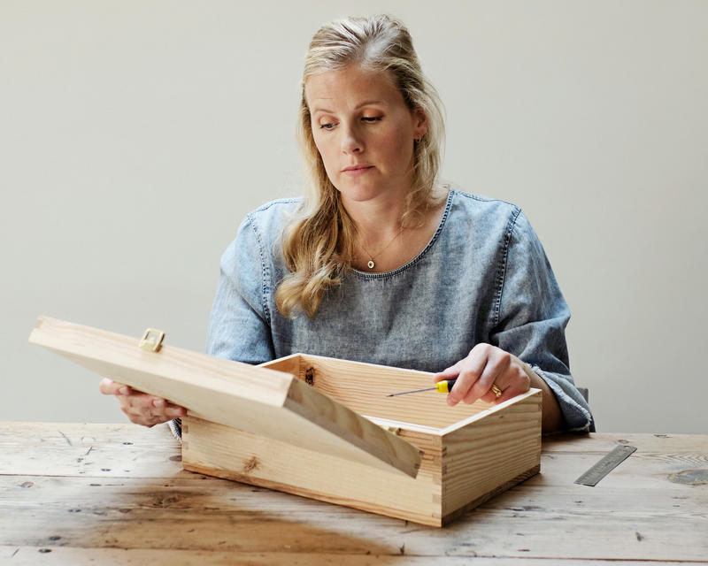
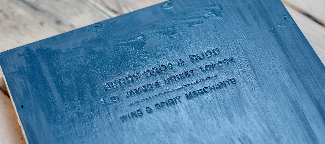
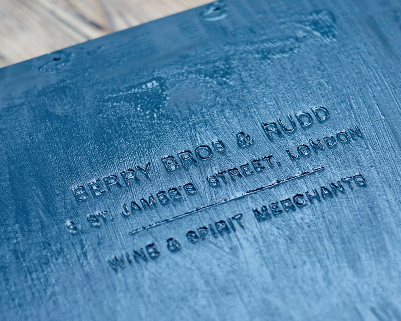
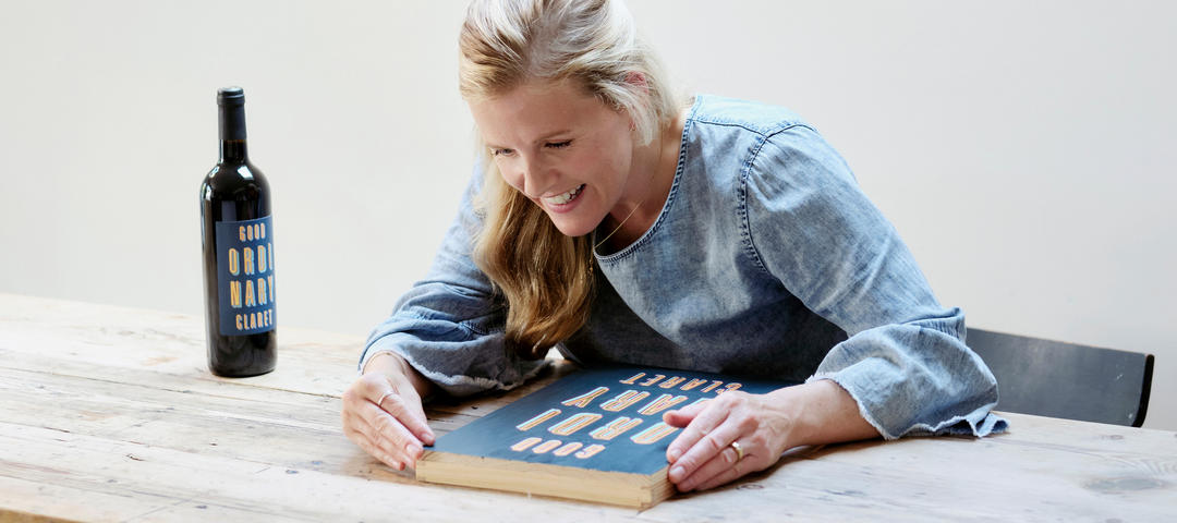
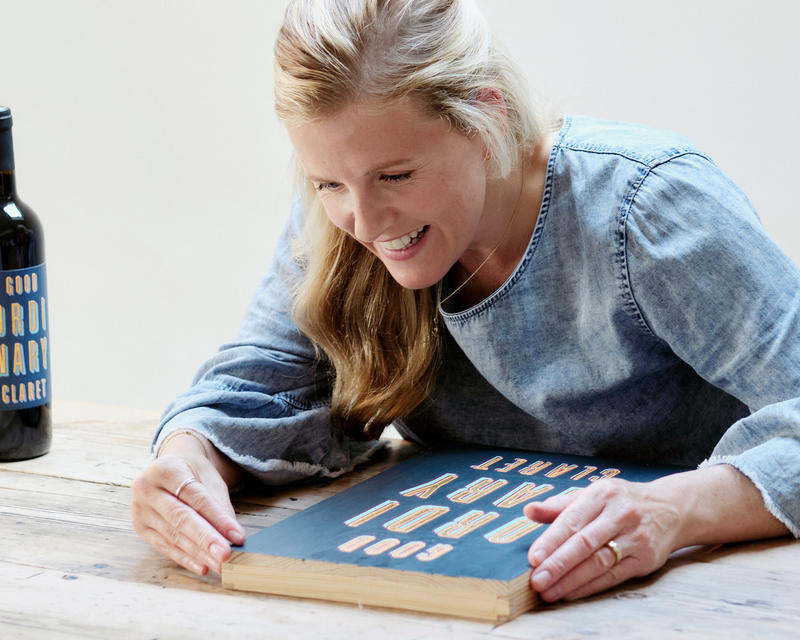
The artwork Poppy created for our new limited-edition Good Ordinary Claret label is striking, geometric and beautiful. For her canvas, she chose to use the wooden lid of one of our wine boxes.
“I really wanted there to be a connection between the physical space at St James’s and the artwork,” she explains. “At the start of this process, I went on a wonderful tour of the Berry Bros. & Rudd buildings and saw all these old wine box cases; I thought that using one would be such a nice canvas – the ratio of the box-lid to a label was perfect and just immediately sprung out to me that that is what I’d like to create the artwork on.”
Next, Poppy painted the box lid a deep, rich blue before marking out “Good Ordinary Claret” in a font which she felt combined contemporary and vintage design cues. “When I spent time at No.3, there is very much a sense of this rich heritage alongside a really contemporary push – you walk through the amazing vaults downstairs that are steeped in so much history, then come up into the contemporary shop, which in itself is home to hundred-year-old bottles of wine. I wanted my piece to have this same harmonious mix.
“The font I chose, Graphique Pro, reflects this. I see it as having quite a vintage 1920s element; I love its elegance, and this sense of the shadow. It is also important to me that when looking at the final piece you can still see the faint trace of the Berry Bros. & Rudd logo; a connection between my artwork font and the Berry Bros. & Rudd one.”
Delighting in the ordinary
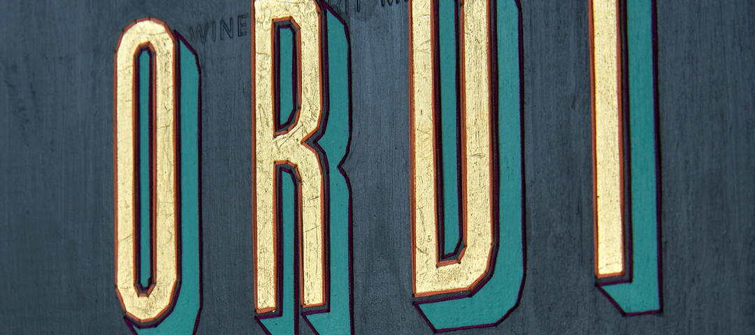
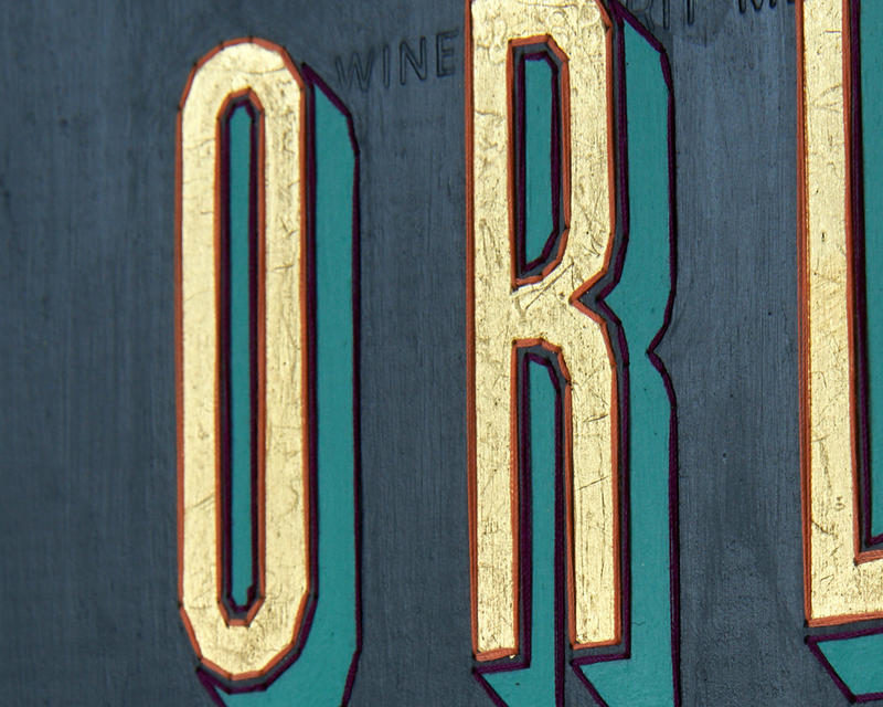
Good Ordinary Claret. “The name was really important to me.” Poppy says. “It speaks so much to the confidence that Berry Bros. & Rudd has in presenting this wine with absolute transparency and authenticity. It shows total trust in the quality of the product, the brand and the wine. And I really wanted to celebrate that.
Here, then, the typography and layout of the design was crucial. “The way I split ‘Ordinary’ is balanced and symmetrical, and for me that’s very necessary. I always draw myself back to symmetry and order.” It’s big and bold, and – in the artwork, if not on the finished bottle label – glitters with real gold.
 16 charas with spaces
“It’s quite striking, and typographic, and so I was confident it would shrink down well to a bottle label,” Poppy says. “I don’t know if you remember when you could put a crisp packet in the oven and it would shrink right down – immensely satisfying in its smaller form – well, it was a bit like that. It worked really well.”
But, though the strength of the design translated well to the bottle, it lost some of its nuance. “You don’t get the textured elements of it on the bottle,” Poppy says. “What I enjoy in my work is that at first glance you don’t necessarily notice the thread until you get up close, but then when you do it adds this over dimension. For the bottle label, it had to become more of a graphic.”
The stitch, then, is important to Poppy. “Every part of the process of my work is a layering; it takes time. Each element can’t be rushed; sanding, painting, mapping out and marking hundreds of pinpointed marks that I have to draw and drill – it’s a very methodical process and there is a meditation in that. It’s careful and precise.”
This meditative, precise stitching; is it a craft, or an art? “I shy away from the term craft,” Poppy explains. “The process of stitching is a craft, but the work itself? That’s art.”
Buy Poppy's limited edition